20130715

w3schools: CSS Tutorial

CSS Tutorial


CSS
Save a lot of work with CSS!
In our CSS tutorial you will learn how to use CSS to control the style and layout of multiple Web pages all at once.

Examples in Each Chapter

This CSS tutorial contains hundreds of CSS examples.
With our online editor, you can edit the CSS, and click on a button to view the result.

CSS Example

body
{
background-color:#d0e4fe;
}
h1
{
color:orange;
text-align:center;
}
p
{
font-family:"Times New Roman";
font-size:20px;
}

Try it yourself »
Click on the "Try it Yourself" button to see how it works.

CSS Examples

Learn from over 150 examples! With our editor, you can edit the CSS, and click on a button to view the result.

CSS Quiz Test

Test your CSS skills at W3Schools!

CSS References

At W3Schools you will find complete CSS references of all properties and selectors with syntax, examples, browser support, and more.

CSS Tutorial

w3schools: HTML Color Picker


Get darker/lighter shades of any color.

Select color:
colormap
 
#FF0000


Selected color:  
Darker/lighter shades:Hex values:
 #000000
 #1A0000
 #330000
 #4C0000
 #660000
 #800000
 #990000
 #B20000
 #CC0000
 #E60000
 #FF0000
#FF1919
#FF3333
#FF4D4D
#FF6666
#FF8080
#FF9999
#FFB2B2
#FFCCCC
#FFE6E6
#FFFFFF


HTML Color Picker

w3schools: Introduction to HTML (html 5 compliant)

HTML Introduction


HTML Example

<!DOCTYPE html>
<html>
<body>

<h1>My First Heading</h1>

<p>My first paragraph.</p>

</body>
</html>

Try it yourself »

Example Explained

  • The DOCTYPE declaration defines the document type
  • The text between <html> and </html> describes the web page
  • The text between <body> and </body> is the visible page content
  • The text between <h1> and </h1> is displayed as a heading
  • The text between <p> and </p> is displayed as a paragraph
lampThe <!DOCTYPE html> declaration is the doctype for HTML5.


What is HTML?

HTML is a language for describing web pages.
  • HTML stands for Hyper Text Markup Language
  • HTML is a markup language
  • A markup language is a set of markup tags
  • The tags describe document content
  • HTML documents contain HTML tags and plain text
  • HTML documents are also called web pages

HTML Tags

HTML markup tags are usually called HTML tags
  • HTML tags are keywords (tag names) surrounded by angle brackets like <html>
  • HTML tags normally come in pairs like <b> and </b>
  • The first tag in a pair is the start tag, the second tag is the end tag
  • The end tag is written like the start tag, with a forward slash before the tag name
  • Start and end tags are also called opening tags and closing tags
<tagname>content</tagname>


HTML Elements

"HTML tags" and "HTML elements" are often used to describe the same thing.
But strictly speaking, an HTML element is everything between the start tag and the end tag, including the tags:
HTML Element:
<p>This is a paragraph.</p>


Web Browsers

The purpose of a web browser (such as Google Chrome, Internet Explorer, Firefox, Safari) is to read HTML documents and display them as web pages.
The browser does not display the HTML tags, but uses the tags to determine how the content of the HTML page is to be presented/displayed to the user:
Browser

HTML Page Structure

Below is a visualization of an HTML page structure:
<html>
<body>
<h1>This a heading</h1>
<p>This is a paragraph.</p>
<p>This is another paragraph.</p>
</body>
</html>


HTML Versions

Since the early days of the web, there have been many versions of HTML:
VersionYear
HTML1991
HTML+1993
HTML 2.01995
HTML 3.21997
HTML 4.011999
XHTML 1.02000
HTML52012
XHTML52013


The <!DOCTYPE> Declaration

The <!DOCTYPE> declaration helps the browser to display a web page correctly.
There are many different documents on the web, and a browser can only display an HTML page 100% correctly if it knows the HTML type and version used.

Common Declarations

HTML5

<!DOCTYPE html>

HTML 4.01

<!DOCTYPE HTML PUBLIC "-//W3C//DTD HTML 4.01 Transitional//EN"
"http://www.w3.org/TR/html4/loose.dtd">

XHTML 1.0

<!DOCTYPE html PUBLIC "-//W3C//DTD XHTML 1.0 Transitional//EN"
"http://www.w3.org/TR/xhtml1/DTD/xhtml1-transitional.dtd">
For a complete list of document type declarations, go to our DOCTYPE Reference.


Introduction to HTML

w3schools: Table cells that span more than one row/column


<h4>Cell that spans two columns:</h4>
<table border="1">
<tr>
  <th>Name</th>
  <th colspan="2">Telephone</th>
</tr>
<tr>
  <td>Bill Gates</td>
  <td>555 77 854</td>
  <td>555 77 855</td>
</tr>
</table>

<h4>Cell that spans two rows:</h4>
<table border="1">
<tr>
  <th>First Name:</th>
  <td>Bill Gates</td>
</tr>
<tr>
  <th rowspan="2">Telephone:</th>
  <td>555 77 854</td>
</tr>
<tr>
  <td>555 77 855</td>
</tr>
</table>

Cell that spans two columns:

Name Telephone
Bill Gates 555 77 854 555 77 855

Cell that spans two rows:

First Name: Bill Gates
Telephone: 555 77 854
555 77 855


Tryit Editor v1.8

w3schools: HTML tables

<!DOCTYPE html>
<html>
<body>

<h4>This table has no borders:</h4>
<table>
<tr>
  <td>100</td>
  <td>200</td>
  <td>300</td>
</tr>
<tr>
  <td>400</td>
  <td>500</td>
  <td>600</td>
</tr>
</table>

<h4>And this table has no borders:</h4>
<table border="0">
<tr>
  <td>100</td>
  <td>200</td>
  <td>300</td>
</tr>
<tr>
  <td>400</td>
  <td>500</td>
  <td>600</td>
</tr>
</table>

</body>
</html>

Tryit Editor v1.8

Art Quizzes - test your knowledge of art and design


Art Movements Quiz


Fauvism Quiz


Impressionism Quiz


Post Impressionism Quiz


Cubism Quiz


Expressionism Quiz


Our Art Movements Quiz tests your knowledge of the great artists associated with each movement and your ability to recognise their individual styles of art.


Ancient Egyptian Art Quiz


Ancient Egyptian Gods Quiz


Ancient Egyptian Hieroglyphics Quiz


Ancient Egyptian Crowns Quiz


Our Ancient Egyptian Art Quiz tests what you know about Ancient Egyptian culture: their Art, Gods, Crowns and Hieroglyphics.


African Mask Quiz


African Mask Quiz 1
African Mask
Quiz 1

African Mask Quiz 2
African Mask
Quiz 2

African Mask Quiz 1 tests your ability to identify individual mask designs while African Mask Quiz 2 tests your knowledge of the people and customs associated with a mask.


Scoring the Quiz

  • At the end of each quiz you get a summary of your results that you can print as a record of your achievement. This includes:
  • The percentage grade you attained.
  • The number of questions answered correctly or incorrectly.
  • The time taken to complete the quiz.
  • A detailed illustration of your results with corrections.

Art Quiz - test your knowledge of art and design

Graphic Design Lessons - Evaluating Your Designs


Evaluation Design
What is Evaluation?
Evaluation is the skill of being able to look at a piece of work and know what is right or wrong with it. It is an instinctive skill but one that you can develop by increasing your knowledge and understanding of art and design through studying the work of other artists and designers.
Why do you evaluate your work?
You evaluate your work to find out what works and what doesn't. It is also important to understand what you have learned from doing the work. What are the new skills, techniques, and concepts that have you grasped through your involvement with the creative process? Each piece of work that you undertake should build upon your knowledge and understanding of art and design leaving you better equipped for your next challenge.
How do you evaluate your work?
When you are evaluating your designs you should consider the following:
  • Images
  • Fonts
  • Layout
  • Target Audience
  • Technique 
Your Images: Consider their suitability for the subject, their style, proportion, arrangement and colour. Could any of these be improved upon by making any adjustments.
Your Fonts: Consider their suitability for the subject, their legibility, style, proportion, arrangement and colour. Could these be improved upon by making any adjustments.
Your Layout: (the combination of images and fonts) Consider the proportions, arrangement, alignment, and colour relationships of the various elements in your design.
Your Target Audience: (your client, buyers, users, readers, listeners) Does your design speak in a language, colour and style that appeals to your target audience?
Your Technique: does your use of media, quality of finish and presentation need to be improved upon?
Graphic Design Lessons - Evaluation

Graphic Design Lessons - Graphic Design Composition Techniques


Symbol 1
Symbol 2
Symbol 3
Symbol 4
Symbol 5
Symbol 6
Symbol 7
Symbol 8
Symbol 9
These graphic design lessons were developed as tools to expand your creativity. Click on each of the symbols above to explore a range of composition techniques that you can apply and adapt when developing ideas and layouts for your own work.
Once you have studied our examples you can find other symbols in our free Graphic Design Resource Sheets that you may print and use to explore your own graphic ideas.
Symbol 1
Symbol 1

Creating Patterns

Snowflake Pattern Formula
Symmetrical forms like our snowflake are ideal for creating repeat patterns. They fit together like tiles. Note how a 'hidden' cube or box is formed at the centre of the design on the right. Designs within designs are often waiting to be discovered. A good designer should always be awake to the possibilities that lie within a shape.

Less Is More?

Less is More
This Christmas card design pushes the pattern technique to extremes. However, in graphic design 'less' is usually 'more' and consequently simpler ideas are often more visually satisfying.

Arranging Image and Type

The Ice Box
The 'hidden' cube or box at the centre of this design suggests an appropriate use for the image: a logo for a refrigeration company named 'The Ice Box'.
The relationship between image and type in any design is very important and there are many ways of linking them. 'Arial Black' was chosen as the font for this design because the breadth of the letters match the thickness of the lines in the image. The triangular arrangement and placement of the type also mirrors the composition of the snowflakes.
'The Ice Box' idea now needs some further work to transform its basic form into a unified design.

Color Links

The Ice Box - Color
Three icy blue tones were added to the image to emphasise the three planes of the 'box'. The same three colors were also used for the type to strengthen the link between the image and font.

Developing the Design

The Ice Box - Color 2
A process of trial and error is essential in developing any graphic idea. In order to try to increase the chill factor in our design, its black outline was removed and replaced by a cold green backdrop. This, however, did not work well as the image lost some visibility and weakened the impact of the 'hidden' box.

Improving the Design

The Ice Box - Color Drop Shadow
In an attempt to improve the design, a drop shadow was added to increase the visibility of the image. This worked well and restored the impact of the design.

Finalising the Design

The Ice Box - Final
As adding the drop shadow had dramatically increased the visibility of the design, the background was deemed unnecessary and removed. Finally, the type was changed to a single colour to improve its legibility. Its drop shadow was also removed to further enhance the visibility of the design.
The solution to 'The Ice Box', like most graphic designs, is the product of a process of trial and error, where error plays a necessary part in the success of the work.
Graphic Design Lessons - Composition Techniques

Graphic Design Lessons - How to Create Ideas for Graphic Design


Symbol 1
Symbol 2
Symbol 3
Symbol 4
Symbol 5
Symbol 6
Symbol 7
Symbol 8
Symbol 9
These graphic design lessons were developed as tools to expand your creativity. Click on each of the symbols above to explore a range of composition techniques that you can apply and adapt when developing ideas and layouts for your own work.
Once you have studied our examples you can find other symbols in our free Graphic Design Resource Sheets that you may print and use to explore your own graphic ideas.

Signs Dictate - Design Educates

Signs Dictate - Design Educates
Our design lessons teach you composition techniques to help you create graphic designs with layers of meaning.
A graphic design is much more than a sign. A sign will only tell you one thing such as 'stop' or 'go'. However, a good graphic design has several layers of visual and verbal meaning that communicate many things.

How to Create Original Ideas

Composition Techniques
Our design lessons teach you composition techniques you can use to create original designs.
The first ideas that you think of are not usually the most original. The reason they are already in your head is because you have seen them before in one form or another. The best ideas are those that you discover by trial and error through composing and adapting the layout of your design.

How to Develop Ideas

Think Outside the Box
Our design lessons teach you composition techniques that you can adapt to develop ideas for any graphic design.
Some students have skills in drawing but struggle when it comes to generating ideas. However, composition is a skill that we can teach you through our graphic techniques.
Graphic Design Lessons - How to Create Graphic Ideas

Graphic Design Lessons - The Art of Typography - Typefaces and Fonts


The original meanings of the words 'Typeface' and 'Font' have become blurred through common usage. Both now tend to be used to describe the various styles of letterforms available to designers and printers.

Typefaces

Typefaces
The term 'Typeface' was originally used to identify the design elements in a letter style e.g. boldunderlined, or italic.
Bold Type can add an emphasis or strength to the style of a font.
Underlined Type is an effective way of emphasising the title of a document. It can also be used to call attention to an important section of text.
Italic Type can also emphasise an important word or passage of text, but it tends to be used in a more informal context. Italic fonts have an animated style and are often selected for designs where there is a need to convey the illusion of speed and energy.

Fonts

Century Font Family
FONT FAMILY: Century
The term 'Font' was originally used to identify a family of typefaces. The fonts above are all members of the 'Century' font family. Their height is measured in points - the standard unit for printed text. There are about 72 points to one inch.
Although the above fonts are all the same height, note how their breadth varies according to their style. Some fonts are more suited to fitting into a confined area of a design, while others like to spread themselves out.
Serif and Sans Serif
TWO MAIN FONT TYPES: Serif and Sans Serif
Serifs are the extended corners at the ends of a letter and like all good design, they have evolved naturally. They originated in the stone-carved letters of the Ancient Romans. Stone masons discovered that it was technically easier to finish chiseling the ends of a letter in a slow curve. Not only did serifs look more elegant but they were also very practical as they formed a natural channel for water or rain to flow away as it cleaned dust from the corners.
Serif fonts are the most legible and are commonly used for large blocks of text. Their wide horizontal baseline emphasises the line of text for the eye and makes reading more comfortable.
Sans-serif fonts are simply fonts without serifs ('sans' means 'without' in French). They are also sometimes called gothic fonts.
Graphic Design Lessons - The Art of Typography

Graphic Design Lessons - Design a Logotype for a Museum


Design a Logotype for a Museum

Logotype Lesson Plan

A logotype is simply a logo, symbol, trademark or brand identity that is mainly composed from typography.
The aim of this lesson is to create a logotype whose style reflects some aspect of a museum or its collection. For our examples below, we chose 
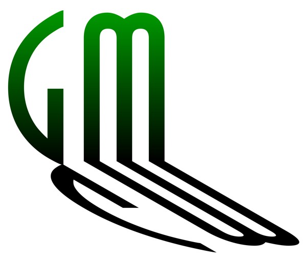
Glasgow Museums as our subject and the letters 'GM' for the logotype.
  • Start this lesson by studying our examples below which explore a range of possible solutions. These designs were inspired by the various exhibitions and collections of art, antiques, architecture, design, music, science, engineering and history that we discovered in our research of Glasgow Museums. However, you can easily adapt this lesson to include any collection from a museum in your own locality.
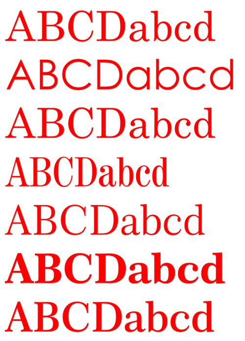
  • Decide on the letters you need for your logotype and print them using fonts from your computer that you feel are appropriate or whose style you particularly like.
  • Next, by drawing or tracing, explore the various ways that you can compose or adapt your letters to create an interesting logotype. Try out techniques such as overlapping fonts; combining different fonts; adding perspective; changing scale and color; or adding a background or shadow.
  • You can get more ideas for developing your logotype by exploring our Graphic Design Lesson on creative techniques.
  • Finally, through your drawings you will gradually begin to understand the design possibilities of the letters and fonts you have chosen. When you reach that point of understanding, you should create several solutions and then select the one you consider the best to be presented as your finished design.

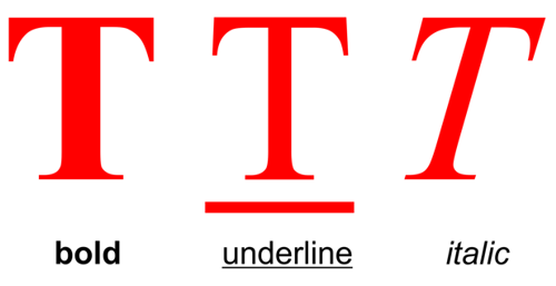
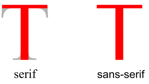
The Elements of Typography

In this lesson it is necessary to understand the elements of good typography and use that knowledge to create your logotype. To help you with this task you should explore the following links:

Logotype Example 1

Logotype Example 1
FONT: Anastasia
This logo is designed using the condensed font, 'Anastasia'. The height of this font suggests the architectural pillars at the entrance to many museums. The shadows represent the end of a pleasant afternoon spent there.

Logotype Example 2

Logotype Example 2
FONT: Arial Black
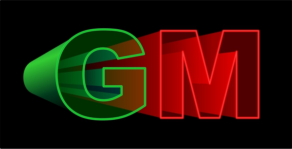
This logo is a transparent 3D projection which could be used to advertise an arts exhibition about the cinema or a science exhibition about the physics of light.

Logotype Example 3

Logotype Example 3
FONT: English Vivace, Jazz
This logo uses two contrasting fonts to reflect the wide stylistic and cultural diversity to be found in the museum's collection. The classical English Vivace is complemented by the ethnic Jazz font suggesting a choice of exhibits to satisfy all tastes.

Logotype Example 4

Logotype Example 4
FONT: Elephant, Old English
This logo combines a modern and medieval font to represent the range of historical exhibits that you could expect to find in the museum.
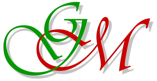
Logotype Example 5

Logotype Example 5
FONT: Avant Garde, Brush Flair
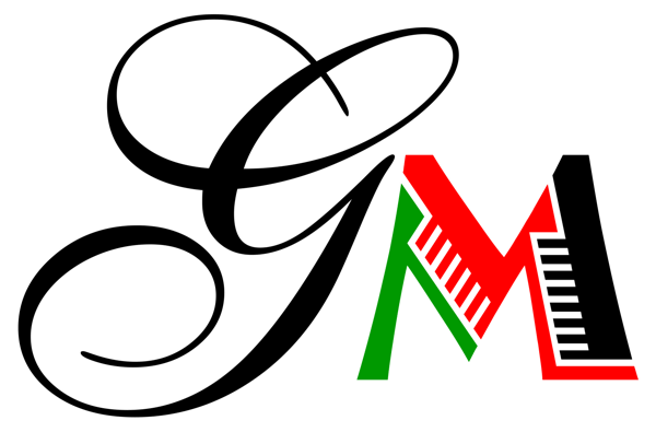
This logo combines a formal geometric font (G) with a spontaneous calligraphic font (M). The combination is used to suggest the idea of fun within a structured environment - the format for most museums.

Logotype Example 6

Logotype Example 6
FONT: Aldo's Nova
This logo uses a modern font that has been coloured like a stained glass window - a craft that is associated with the past. This combination of the new and the old links the present to the past which, in effect, is the function of most museums.
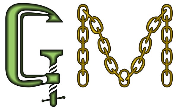
Logotype Example 7

Logotype Example 7
FONT: Toolshopcaps
This logo uses a novelty font that substitutes objects for letters. The tools that represent the 'G' and 'M' could be used to advertise an exhibition about the industrial past.

Logotype Example 8

Logotype Example 8
FONT: AdLib
This logo overlaps the bold 'G' and 'M' of the Ad Lib font to create a dynamic interaction of shapes and tones that are evocative of abstract art.

Logotype Example 9

Logotype Example 9
FONT: Vivaldi
This logo uses a flamboyant font that is named after the composer, Antonio Vivaldi. Its flowing calligraphic curves recall the form of a treble clef on a musical manuscript and consequently suggest its ideal role - to advertise a musical recital at the museum.
Graphic Design Lessons - Designing a Logotype